Truth is Golden - 301 | In Praise Of Craft w/ Fraser Greenberg

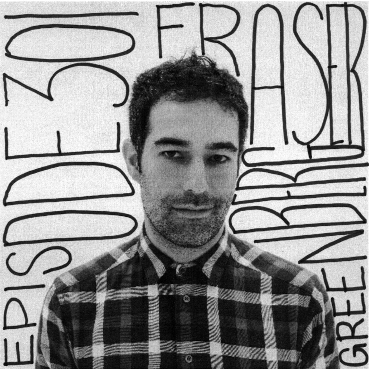
Fraser Greenberg and I spoke at length about his Toronto upbringing, how he stumbled into family business and transformed it to thrive an ever-changing market as well as his latest endeavour, the coffee shop Milky’s in Toronto’s West End. What struck me about Fraser is the consistency with which he bring passion, purpose and an amazing sense of craft to everything he touches. A fascinating guest with great ideas, check out Fraser’s interview to learn more about him.

Hello, World!

About the podcast: The intent behind our podcast series "Truth Is Golden" is to look at renowned creatives and their work with a critical eye. We aim to ask deep questions in order to peel back the layers of marketing, clever one-liners and sexy branding. We want to show the world what it truly takes for genuinely creative forces to find their own voice build a career on what is very often nothing more than a drive to do things differently. We want to hear about the successes, the failures, the inspirational stories and the lessons gleaned from all of it. We want the truth, so that we can inspire other people to fulfill their own creative aspirations and in the process contribute to making the world a better place.


Credits:

Post-Production: Ryan Aktari

Music: Bounce Trio, Star Animal, 2014.

Organ & Keys : Matthieu Marthouret

Ténor Sax : Toine Thys

Drums : Gautier Garrigue

Composed by Toine Thys (copyrights SABAM).


Buy it on BandCamp :

https://weseemusicstore.bandcamp.com/album/small-streams-big-rivers


More info and music here :

http://www.youtube.com/user/weseemusic

http://www.matthieumarthouret.com

https://www.facebook.com/MatthieuMarthouret.Music/


The Truth On Architectural Imagery

Reading time ~10 minutes

pexels-photo-712786.jpeg

Introduction:

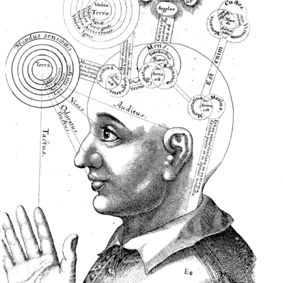
The latest developments of evolutionary psychology teach us that our sensory perception of reality is not the window into the truth that we’ve assumed it was for a long time. Rather, it’s more like a metaphorical desktop on a computer, where the reality of the computing power if hidden behind symbolic representations of reality (e.g. the file folders on a virtual desktop). That helps us accomplish our tasks without being burdened by the minutiae of the computer’s inner workings, which would never allow me to easily and effortlessly write this piece as I was able to do, if I had to literally try and understand how everything works in a computer, down to micron-sized transistors.

What that means in concrete terms, is that evolutionary psych. tells us that we don’t see the world as it really but rather that we interpret it, these interpretations being a reflection of our evolutionary fitness. I.e., we have evolved interpretations of reality that allowed us to survive and thrive.

By the same token, since there is no such thing as an accurate perception of reality, the same goes for how we create visual media that represent the world around us. I would go as far as saying - in the example of a photograph or video of a space - that the very act of creating and designing an image of a space or building is in itself an interpretation of the object itself, influenced by the mind creating it. Not to mention the fact that we lose the 3rd and 4th dimensions (the 4th being time) and reduce the representation of the space to a 2-dimensional plane. Therefore, there can be no accurate representations of the physical space, as it’s always going to be incomplete, due to the missing dimensions.

As we just demonstrated that we cannot by design, perceive - and therefore  - represent the world around us in a truthful manner, we cannot expect an imperfect representation, or rather approximation of reality to be truthful. Not to mention that visual media in architecture is further removed from reality due to the subjective interpretation of the creative mind crafting the media, reality and truth is a myth that can never be reached.

Now that this is out of the way, what does it mean with regards to the truth and narrative in architectural media? Well, I’m glad you asked and we can proceed to answer to this question from two different perspectives, each considering a discrete aspect of the architectural documentation process.


The commercial aspect:

Architects are professional service providers and as such, have to be able to show their work in its best light, in order to convince prospects to hire them. To do that, a portfolio of images is a critical tool in the sales process. Much like any other kind of commercial photography, one can make a case that doctoring images in order to rid the iconography of the things that don’t convey the vision of the architect is fair game, and that’s the opinion of one of my peers. If you look at food or automotive photography, these guys routinely cheat in order to get images that represent the ideal of the product they’re selling and not the product itself, as you and I would experience it.

Even though what other industries are doing can be pretty dramatic in term of how far they’re willing to go to make a product look better than it actually is, nobody is ever accusing them of lying or being dishonest. That’s because if you go buy that burger or that car as a result of seeing an idealized version of it in an ad, you will still get the same thing, it just won’t look as good in the physical world, but it’ll still taste the same or perform as promised.

The same can be said of architecture and in this context, I think it’s OK for architects to fairly dramatically alter images if the end result is not quite what the original intent was. For example, I have more than once digitally “stained” wood finishes on a building’s exterior that was initially supposed to be a very dark stained finish, but had never been finished and was therefore showing up as a much lighter tone of wood than the architect intended. In that context, I personally have no qualms making such a change.

We also routinely remove electrical outlets, smoke alarms and exit signs that are both unsightly and create visual clutter. What we end up with is a clean, more focused imagery that better conveys the sense of space in my opinion, which in turn serves the commercial intent of these images.

All those changes do not fundamentally alter the physical experience of the space and do not speak to its performance. Again, let’s keep in mind that we are talking about 2 dimensional interpretations of a space the we experience in 4 dimensions and that there is no substitute for an in-person experience. In that sense, any image, doctored or not, is always going to be a somewhat deceitful representation of the space.


The ethical aspect:

Now, from an ethical perspective, one could convincingly argue that doctoring images is dishonest and does not represent the project as it is. Ignoring for a moment that a photograph (or a movie) is an incomplete representation of the physical space because it lacks 1 or 2 dimensions, an argument can be made that architectural media should take on a more documentary-like approach to the craft.

Supposing that this is feasible and realistic, I think it’s a weak argument because even a documentary medium -especially film- tells a story that is a representation of the author’s thoughts and opinions. While the media may not be altered per se, it’s the narrative that expresses an inherently biased opinion. And I think that’s the crux of the issue, that short of directly experiencing a space or a building, any other form of representation, doctored or not represents the artists’ biased view through a narrative. It is therefore very difficult to say that a photograph (or movie) is a truthful representation of reality

A few years ago, and incident with the Chicago chapter of the American Institute of Architects (AIA) made the news when it was revealed that an award winning building image set had been doctored, where unsightly (and very visible) air handling units on the roof of the building were removed in post production at the behest of the architect. In the article quoted above, Blair Kamin, the Chicago Tribune’s architectural critic described the oversight as follows:


“So the honor award puzzled me. How could a jury of respected architects from out of town have missed this glaring misstep? Easily, it turned out.

Unlike the AIA's national awards, which require that at least one juror visit a short-listed building, or the Pritzker Architecture Prize, whose jury travels extensively, jurors for the Chicago AIA honors typically don't inspect buildings firsthand. There simply isn't the time or money. The jury meets for just one day. In the distinguished building category, there are scores of entries (134 this year), and they consist of projects from all over the world. So according to people who administer the contest, the jurors consider required materials (design statements and photographs) as well as floor and site plans, which are optional.”


To me, the issue is only partially the responsibility of the architect and/or the photographer. In this case, it’s clearly the jury process itself that created conditions for a doctored image set to allow for Juan Moreno’s building to win an award.

The AIA has since issued new rules for their award submissions regarding retouched images, although I couldn’t find these rules in my research. I think it’s great change, because when it comes to awards, we step outside of the realm of strictly commercial photography and that we can and should reasonably expect images to not be purposely deceiving. It can easily be speculated that the building wouldn’t have won the award, had the images not be photoshopped. Since awards don’t have as much of a commercial component (although some privately-owned award competitions are huge money makers for the organizers, but that’s a debate for another article) and are supposed to be an objective assessment of the entries and determine the winners based on the merit of the work, there should be an expectation that images not be modified and in my opinion, it falls on the organizers to demand more truthful imagery.

Similarly, publications reporting on architecture, have a moral duty to ensure that the projects they publish are not overtly deceiving as it erodes the reputation of both the magazines and the designers, especially when it comes to publicly accessible architecture that can be experienced by the general public. It would be very damaging for a magazine to talk up an innovative building only to find out that half the innovations are being impeded by some unsightly design element.


Conclusion:

I don’t believe that the conclusions we can draw from this topic are either black or white. Ultimately, each player in the process, be they photographers, architects, publications, award organizers or critics have a duty to ensure that they’re not purposely deceiving their public.

I think the amount of doctoring that should be tolerated should fall on a spectrum from heavily retouched, to very slightly retouched and that were the imagery falls on the spectrum is dependent of what one is comfortable with and what is appropriate for the intended usage of the images.

Some architects and photographers will have specific opinion in favour for the more honest side of the spectrum while others will unabashedly put out images that have less to do with reality and more with the commercial aspect of their practice. Azure published a very well thought-out article on the topic last year and their conclusion was thoughtful and fairly accurate representation of the variety of opinions that are out there.

I personally do a fair amount of retouching but I do draw the line at doing work that would alter the architecture and represent the space in a way that could never happen in reality. Outlets, exits signs and smoke alarms are all fair game and so are blemishes on a wall, reflections in glass, etc. I am also a little more liberal for residential work as the issues we fix are often a matter of the construction process not being faithful to the original vision or the client making changes without the architect’s knowledge.

I would generally say that restraint and common sense are ultimately our best allies. I’m a big fan of trusting my gut when it comes to making decisions that aren’t easy and the science backs me up on this.

I think the biggest takeaway from this discussion is that we ought to be very conscious of the impact the decisions we make will have down the road and act accordingly within the boundaries of what each of us is comfortable with. The rest is just noise.


Arnaud Marthouret is the founder of rvltr and leads their strategy, visual communications and media efforts. He has helped numerous architects and interior designers promote themselves in their best light - pun intended - in order to help them run more effective practices and grow in a meaningful way.

If you have questions about this article or rvltr, or want to chat about your strategy and communications, you can leave a comment, share with a friend, or reach him at arnaud{at}rvltr.studio.

Truth Is Golden ep. 206 - Loosen Up A Little, with Paul Petrunia

In episode 206, the third instalment in our series on LA creatives, Paul Petrunia talked about his upbringing in the Canadian prairies, how Arthur Erickson influenced him to be an architect, his ill-fated career as a teen ballet dancer and his cultural confusion as an expat torn between American and Canadian cultures. Going back to the early Internet days when he started a dot-com business in the middle of the lake late 90's boom to today and his life as the man behind the popular Architecture website archinect.com.

About the podcast: The intent behind our podcast series "Truth Is Golden" is to look at renowned creatives and their work with a critical eye. We aim to ask deep questions in order to peel back the layers of marketing, clever one-liners and sexy branding. We want to show the world what it truly takes for genuinely creative forces to find their own voice build a career on what is very often nothing more than a drive to do things differently. We want to hear about the successes, the failures, the inspirational stories and the lessons gleaned from all of it. We want the truth, so that we can inspire other people to fulfill their own creative aspirations and in the process contribute to making the world a better place.

Credits:
Post-Production: Ryan Aktari
Music credit: Bounce Trio, Star Animal, 2014.
Organ & Keys : Matthieu Marthouret
Ténor Sax : Toine Thys
Drums : Gautier Garrigue
Composed by Toine Thys (copyrights SABAM).

Buy it on BandCamp :
weseemusicstore.bandcamp.com/album/smal…big-rivers

More info and music here :
www.youtube.com/user/weseemusic
www.matthieumarthouret.com
www.facebook.com/MatthieuMarthouret.Music/

Truth Is Golden Ep. 205 - Less Is More Or Less w/ Dan Brunn

Dan Brunn’s early life in Tel Aviv, subsequent move with his family to Southern California at age 7 and his later nomadic lifestyle as a adult certainly did not make his life easy, yet set the stage for a highly creative and driven character to develop. Someone as uncompromising as he is a kind soul who wants to do good in the world. Dan is a young architect based out of LA creating buildings inspired by the Bauhaus aesthetic he grew up around in Tel Aviv, but also influenced by Southern California modernism. We chatted about what moves him, his very early love for architecture, his influences as well as his love of cars, music, food and travel. Listen in to hear Dan speak about his work and life.

Truth Is Golden Ep. 203 - There Is Something Funny About This

In episode 3 of our second season, I talked to David K. Levine a distinguished academic, political economist and popular author. We talked about his midwestern childhood, how economics can explain a lot of modern society challenges, his transplant life in Europe and how one of the biggest risks he took was a late-career change, taking on subjects he was not an expert in. Listen in to hear more about David and his accomplishments.

Kicking Fear In The Nuts

Writing these articles for you my dear readers, is always a challenge.

“Will they like what I have to say?”

”Does it even make sense?”

“Will I look stupid?”

“Is it a bad idea?”

“Will it fail?”

“Is there value in it?”

Those are some of the questions that I constantly have to grapple with, in an effort to fight off my second-guessing self, that little voice that always finds very rational, if not “beneficial”, reasons to not do something. I’ve learned from experience that this gut feeling, this fear, is my brain pulling convincing tricks on me to keep me inside the proverbial comfort zone.

I also know that coming out of that comfort zone is where the most learning and growth happens. I’ve seen it time and time again, in me and others. I know people who purposely push themselves past every one of their fear as an exercise in testing their boundaries. In return, they get so much more than they bargained for.

Historically Influential figures like the Eames and Bukowski, among many others, overcame their fear of failure on a daily basis which in turn shaped them as the masters of their respective fields we know today.

The Eames invited and welcomed failure. They saw it as a way to quickly learn and come to an optimal solution, the result of many brains, not just their own, tackling a problem, failure being the mechanism enabling them to shed the bad ideas and only keep the good ones, slowly arriving at a solution that while maynot have been perfect, it had been optimized through an iterative process. It’s been said that new hires in their office would be tasked with work they had no expertise in, like a graphic designer being asked to think up a building concept. It was a clever way to send a powerful message to their employees: don’t let fear of failure stop you.

Bukowski wrote for over 25 years before he got his first novel published, at age 50. An epic failure by any conventional standards, but he didn’t write to fulfill someone else’s definition of a successful writer. He wrote because he had an insatiable urge to create and overcame his fear of not making it by not worrying about the outcome, he just wanted to write. He was eventually able to make a living as a writer. Ironically, the first two thirds of his life before his late career as a full-time writer are in large part what made him such a compelling writer. Indeed his semi-autobiographical novels were heavily inspired by his own life and we wouldn’t have his amazing body of work to enjoy if it weren’t for him grinding for 25+ years relentlessly sending out manuscripts to publishers.

Fear keeps us from doing what the Eames, Bukowski and countless others have done before. Fear of failure, fear of not being able to pay the bills, fear of not looking good, fear of disapproving opinions and the countless other excuses that our cunning little brains cook up to keep us safe. The problem is that this safe zone is antithetical to growth, learning and accomplishing something greater than ourselves.

The key to overcoming fear and become comfortable with being uncomfortable is to find what moves you. Call it a purpose or a mission. With a clear mission, it becomes a lot easier to push past fear and be uncomfortable, in service of something greater than ourselves. With strong values and a clear goal, the path lays itself down and all it takes is actually doing the hard work to make it happen. Hard work being the operative word. In the course of this work, failure is inevitable, embrace it and make it a central part of your learning.

The most successfully durable companies in the world, are those with an undeniable sense of purpose and a clear mission (Zappos and Whole Foods are great examples of this) and if you look into their history, their wake is littered with personal and professional failures. But it is their seeking and embracing failure as well as their ability to learn from it in order to better themselves that makes them great today.

Don’t wait for permission to do something, nobody will ever give it to you. Get out there and try new things. If it fails, you’ll learn more from failure than you will from success. It’s time to boldly get out there and kick fear in the nuts!

If you liked this, share with a friend and let us know in the comments!

Truth Is Golden 202 - We're All Going To Die

In episode 2 of our second season, Stefan Hunt, recounted his -short- life story, from a typical western childhood in New South Wales, Australia, to his early foray into film making, crossing the US at 18 with no money, a bieber haircut and a drive to surf all 48 states, including the 20+ landlocked ones. His first film, self-described as “cringeworthy”, got him some attention and eventually led him to become the multi-talented professional filmmaker, artist and storyteller he is today; all the while continuing on his literally off the beaten path journey. Listen in to hear more about how one can be a highly creative, decent and compassionate human being at the same time.

“Toronto Engaging Over Art”

Press Contact Info : arnaud marthouret | revelateur studio toronto | t: 647-996-9220 | hello@revelateur-studio.com

For immediate release.

“TAXONOMIES”

featuring Ultradistancia by Federico Winer and  Architectural Inoculation and Attracted Opposites by Arnaud Marthouret.

Toronto – 18 March 2016 – “TAXONOMIES” featuring Ultradistancia, Architectural Inoculation and Attracted Opposites was a massive success. The dynamic playful show lived up to expectations providing a perspective centered on global human placement, as well as a look at how we as a species interact with the surrounding environment; built or natural. This is not a critique or praise of human activity, but rather a starting point for discussion for the viewers. For them to come to conclude their own perspectives on today’s times, and our interactions with the world at three different scales: Macro, Meso and Micro.

“…Opening night, over 200 art lovers and collectors came to see “TAXOMOMIES” and Ultradistancia… It helps you to understand that your art can reach all audiences, such as the fantastically curious and educated Toronto scene,” says Federico Winer, (macro + Ultradistancia). Further, Federico remarks, “… the show was a perfect collaboration between artists who are devoted to space, though we see the way we see the earth in diffferent ways, we can appreciate this is the way we both perceive earth and space.

In short, “TAXONOMIES” is Arnaud Marthouret and Federico Winer “brainchild” after meeting 6 months ago via Arnaud reading an article about Ultradistancia. Feeling inspired to contact Federico -- they have been on a roll ever since. The two began discussing how to collaborate on a show, found a gallery that fit their style and built a small international team to make it happen.

“… The show itself is a culmination of months of work, with a great team, which made it successful… and as my first professional art show, I look forward to doing many more. I truly enjoy discussing how blending art and architecture, specifically as the line between them grows thinner and thinner -- especially given my day job as an architectural photographer -- is extremely exciting for me...” says Arnaud Marthouret, (meso + micro/Architectural Inoculation + Attracted Opposites)

ONLYONEGALLERY was an extraordinary space for the event. The artwork, being architectural and environmentally focused was very complimentary to the 3,000sf raw gallery space. Large walls, tall ceilings and multiple levels gave viewers opportunity to see art at all scales: Macro, Meso and Micro.

Gallery owner, Cais Mukhayesh said, “… “TAXONOMIES” featuring Ultradistancia, Architectural Inoculation and Attracted Opposites was a huge success with serious continued interest… people have returned to the gallery daily since the opening.” He also stated, “the show was an amazing time, people were super pleased with the artwork, and there was a constant flow of people over the course of 6 hours… what more can you ask for!” Cais also mentioned, “ONLYONEGALLERY goes above and beyond to bring new and upcoming artists and concepts to light. Providing a platform for showing new works, potential collaboration with other artists (as well as what I would call an almost “mentorship” by Cais); truly a unique opportunity for up and comers.

“TAXONOMIES” featuring Ultradistancia, Architectural Inoculation and Attracted Opposites is up through March 26, 2016 at ONLYONEGALLERY (located at 5 Brock Ave. Toronto, Ontartio, M6K 2K6). Their hours are Sunday through Tuesday by appointment only (cais@onlyonegallery.com); Wednesday through Friday 3:00pm to 7:00pm; and Saturday 12pm to 5pm. Make sure to call ahead, the artists love to hang out at the gallery!

For professional photographs from the show visit the ONLYONEGALLERY Facebook page HERE!


About the Artists + Gallery

Federico Winer

Federico Winer, born in Buenos Aires, Argentina, is a multi-faceted artist, photographer producer, a habitual traveler and super friendly, colleague and collaborator. With his background in Political Science, Philosophy, Architecture and the arts, it was natural for Federico to become a professor of Political Philosophy at the University of Buenos Aires, where he is currently teaching. He is also the founding member of the Experimental Group of Experimental Thought Soy Cuyano, with several academic and art performances in Argentina and Europe.

For information visit Ultradistancia or federicowiner.com

Arnaud Marthouret

Born in Grenoble, France, Arnaud Marthouret, founding partner and lead photographer of revelateur studio is a trained architect and architectural photographer. As an inherently creative person, he brings an imaginative perspective that often categorizes him as quirky artist but that only feed his insatiable curiosity and thirst for the new and unusual. These traits he cherishes and nurtures to this day, as they allow him to understand the world with a different attitude.

revelateur studio (Arnaud Marthouret)

revelateur studio brings together many curiosities uniting slightly schizophrenic yet opposite lifestyles: hip cosmopolitan urbanite vs. outdoorsy nature lover. The studio’s work goes the extra mile to ensure integrity for each building, photographically, which inspires and deserves the best photographic representation. revelateur studio works with a team of the highest level photographers, photography assistants, PR professionals, stylists, film-makers, graphic designers, coaches and mentors.

For information visit www.revelateur-studio.com

ONLYONEGALLERY (OOG) was created in December 2011 as a limitless experiment in concept space. OOG is about collaborating, creating, and demonstrating something special - a live physical experience. OOG is a multidisciplinary studio and gallery that hosts and produces individual and group exhibits. OOG is proud to support emerging and established artists alike, to present a roster of ambitious exhibitions, and to act as a creative hub where ideas come to life. In July of 2015 OOG relocated to a new 3000sq ft. gallery space in the heart of Parkdale, Toronto.

Cais Mukhayesh

Cais Mukhayesh is the owner, director and curator at ONLYONEGALLERY located in Toronto, Canada. Since 2011 he has worked intensively with both local and international artists, photographers, and musicians; producing over 30 art shows, exhibitions, and events showcasing primarily urban contemporary art, music and culture. Cais has worked on many successful creative partnerships with companies such as Absolut Vodka, Jameson Whiskey, Havana Club, Molson-Coors, Steamwhistle Breweries, Iishiko Japan, Hennessey and Saks 5th Avenue; as well as established an impressive roster of talented artists.

For information visit www.onlyonegallery.com